AIRGAP: Assessing Inequality in Risk from Global Air Pollution
Published:
Air pollution kills over 7 million people annually. However, it can disproportionately affect some communities with lower socio-economic status. AIRGAP helps analyse and visualize this environmental justice issue and help close the gap in inequality. The application we built gives users the power to zoom into any area of interest around the world, and visualize how the environmental hazards posed by poor air quality intersect with the vulnerability posed by economic hardship
How can you use AIRGAP?
Click here to try out AIRGAP yourself or watch this 30s introduction video.
How we addressed the challenge
We have created an interactive app that allows users to see how air pollution disproportionately affects communities that lack the financial resources to avoid negative health outcomes. Here, we first characterize air quality using a combination of remotely sensed particulate matter and carbon monoxide inputs, then set thresholds based on the commonly-used Air Quality Index standards as shown below.
To approximate poverty, we use a night-time lights dataset, which is known to correlate strongly with economic production. This approach accounts for differences in the base economic output of countries, allowing for a global analysis.
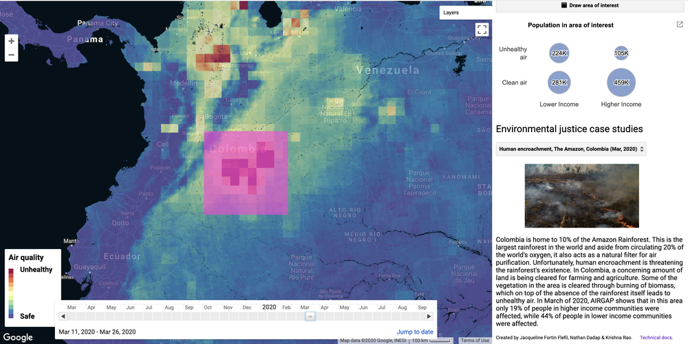
The AIRGAP tool allows users to select an area of interest (AOI) and a specific time frame to see the air quality in any region of the globe at a given time. Once the area has been selected, as depicted by the pink square in the figure below, the tool produces a bubble chart on the right of the image that shows the classification of lower/higher income and clean/unhealthy air along with how many people fall into each of the four categories.
Within the tool, we have included 7 brief case studies that the user can go through to highlight air quality events and circumstances throughout the world at different times between 2019 and 2020. These include wildfires, urban pollution, and human encroachment. We incorporated these case studies to bring attention to times and occurrences where we can see the different effect on people in the two income categories. However, the user is free to pan through the map to any place, choose a specific time, and draw an AOI that they would like to learn more about.
In the near future, we plan to expand this tool to encompass broader definitions of vulnerability (e.g., access to health services, elderly or young populations, and other demographic indicators) as well as a broader suite of environmental hazards that are predicted to worsen over the next few decades (e.g., sea level rise, extreme temperature, tornadoes, hurricanes, etc.).
How we developed this project?

Moved by scenes of environmental injustice in Flint, Michigan, and disturbed by images of increasingly severe wildfire, hurricanes, and flooding around the globe, we set out on this project focusing on one central question:
How can we leverage various data sources to visualize how environmental hazards intersect with vulnerable populations, thus perpetuating environmental inequity?
Given our experience working with satellite data in Stanford University’s Remote Sensing Ecohydrology Group, we focused on using publicly-available datasets. Luckily, many of these datasets are already available for use on free platforms including Google Earth Engine, which we used here. Previous experience with Google Earth Engine’s code editor and JavaScript app development came in handy for developing our app.
Our initial concept was to look for indicators of air quality as well as some sort of “vulnerability” metric. For air quality, we wanted to find data products that gave us information about any of the six criteria air pollutants as defined by the EPA. The Copernicus dataset gave us particulate matter information for particles with diameters less than 2.5 micrometers, and the Sentinel dataset gave us data about carbon monoxide levels. Particulate matter is always one of the most important metrics people use when talking about air pollution, although it does not give information about the chemical composition of the suspended particles. Carbon monoxide measurements were readily available in near real-time and at a high spatial resolution, and this criteria air pollutant is also a by-product of fossil fuel combustion and biomass burning, so we felt it was a good indicator to enhance the PM2.5 dataset and get aggregate air quality.
When looking at vulnerability, we had some ideas for obtaining GDP maps, poverty maps, or other similar indicators. As mentioned above, lower income communities lack financial resources to avoid negative health outcomes as they tend to have less access to healthcare providers and routine medical attention. This implies that prolonged exposure to harmful air pollutants can lead to more severe illnesses than if healthcare and other resources were easily accessible. However, finding a dataset with this information proved to be a more difficult task than we had anticipated. Unable to find a high-resolution, gridded raster product directly related to income or wealth, we performed preliminary research and found academic papers where nightlights were used as inputs for predicting wealth. Therefore, we obtained the VIIRS high-resolution nightlights product and used this as our proxy for an economic vulnerability indicator.
While data on environmental hazards have been well-studied in the academic sphere, we feel that issues of population vulnerability and environmental justice remain understudied. Thus, our team was motivated by the desire to highlight the inequalities that increasing pollution, environmental mismanagement, and climate change may exacerbate in the years to come.
What data we used?
For this project, we utilized several products from NASA and its partner space agency ESA, namely:
- The Visible Infrared Imaging Radiometer Suite (VIIRS) Stray Light Corrected Nighttime Day/Night Band Composites Product to use nightlights as a proxy for wealth
- Copernicus Atmosphere Monitoring Service (CAMS) Global Near-Real-Time particulate matter (PM 2.5) data in order to assess air quality
- Sentinel-5P NRTI CO: Near Real-Time Carbon Monoxide to combine with PM2.5 and get an enhanced estimate of air quality
When tackling this challenge we knew we wanted to focus on inequality at the subnational level, as fine as we could go, so data resolution was important to us. While there are many high-resolution gridded data products available, we wanted the products we used to be reliable and accurate, which is why we chose the three NASA and ESA datasets above.
Furthermore, since we were tackling this challenge on a global level and we had only 48 hours to do it, it was important for the datasets to be easily accessible both on the back-end as well as by the users. Google Earth Engine allowed us to visualize and work with these three data products easily while also providing a JavaScript framework for us to build out the app.

